 OpenTemplOpen the editor
A halftone duotone poster prompt for ChatGPT
Updated November 2026
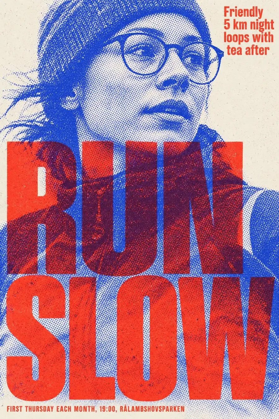
What this style is
A photograph converted to a coarse halftone duotone, printed in two fluorescent inks on uncoated paper, with giant condensed type that overprints and multiplies against the picture. It looks like a riso or screen print, not a filter.
What makes it look like this
- photo as visible halftone dots
- type overprinting the face
- two clashing inks only
- text block top right in the second ink
- corner credits
Colours
#F4EFE2#3B49E8#FF4B3F#FF2D87#D8F41C
Choose two high chroma inks that clash on purpose, such as blue and red or pink and lime. For a brand, take the main and accent colours as the two inks and set paper to a warm neutral.
The prompt
Paste this into ChatGPT with image creation on. Change the subject and the three lines of words for your own, and check the spelling before you send it.
Create a finished graphic design: a poster in A3 portrait (1:1.41) format. It is for: Monthly night run club for beginners.
It must look designed and made by hand by a skilled human designer and illustrator, in the style described below. Treat the style as a strict art direction.

STYLE: Halftone Duotone
A photograph converted to a coarse halftone duotone, printed in two fluorescent inks on uncoated paper, with giant condensed type that overprints and multiplies against the picture. It looks like a riso or screen print, not a filter.
Signature moves to keep:
- photo as visible halftone dots
- type overprinting the face
- two clashing inks only
- text block top right in the second ink
- corner credits

SUBJECT
Show Monthly night run club for beginners in this style. Make the subject the hero and fit everything to it: props, setting and details should belong to this subject, not to the example the style came from.

COMPOSITION
The photographic subject is cropped tight and large, centred or slightly off, with two or three lines of massive type running across the face and body, left aligned. A small paragraph of text sits in the top right corner and tiny credits in the corners.

TYPOGRAPHY
Heavy condensed or bold grotesk capitals in the second ink, giant, multiplying over the image, with small justified text paragraph in the same ink.
Render exactly these words, spelled exactly as written, and no other text anywhere:
- headline: "Run Slow"
- second line: "Friendly 5 km night loops with tea after"
- small details: "First Thursday each month, 19:00, Rålambshovsparken"
Give them a clear hierarchy: the headline large and dominant, the rest much smaller.

COLOUR
Palette: #F4EFE2, #3B49E8, #FF4B3F, #FF2D87, #D8F41C. Choose two high chroma inks that clash on purpose, such as blue and red or pink and lime. For a brand, take the main and accent colours as the two inks and set paper to a warm neutral.

TEXTURE AND FINISH
Visible halftone dot screen, ink overlap colour, grain, slight blur from the press.

AVOID
- full colour photography
- smooth gradients
- drop shadows
- glossy finish
- lens flare
- gibberish text
- anything that looks AI generated: plastic sheen, airbrushed skin, overly smooth gradients, glow and lens flare, HDR, stock photo smiles
- gibberish letters, made up words or any text other than the exact words given
- watermarks, signatures, UI elements, borders or frames around the design
- filler decoration: sparkles, floating dots and stars, confetti, random geometric shapes, gradient orbs, ornamental dividers
- uniform line weight, plastic or airbrushed shading, soft storybook gloss, perfect symmetry, melted or merging details, impossible objects
- showing the design as a mockup (a poster on a wall, a phone, a hand holding it): the artwork itself must fill the whole canvas edge to edge, flat and straight on

Do not search the web or look anything up: work only from this brief, so nothing from elsewhere leaks into the design.
Make the image now, in A3 portrait (1:1.41) format, without asking questions first.
(Brief written with OpenTempl, the free, open source design app at opentempl.org. The designer brings the picture back there to set and edit the words.)
How to use it
- Open ChatGPT and check that image creation is available on your account.
- Paste the prompt. Replace the subject line and the words in quotes.
- Send it. If something is off, ask for one change at a time.
- Check every word on the poster. A typo in your prompt is copied into the picture.
Three versions for common jobs
The same prompt, set for a gig poster, an Instagram post and a menu. The words are examples; replace them.
Gig poster
Create a finished graphic design: a poster in A3 portrait (1:1.41) format. It is for: a live music night with three bands at a small venue.
It must look designed and made by hand by a skilled human designer and illustrator, in the style described below. Treat the style as a strict art direction.

STYLE: Halftone Duotone
A photograph converted to a coarse halftone duotone, printed in two fluorescent inks on uncoated paper, with giant condensed type that overprints and multiplies against the picture. It looks like a riso or screen print, not a filter.
Signature moves to keep:
- photo as visible halftone dots
- type overprinting the face
- two clashing inks only
- text block top right in the second ink
- corner credits

SUBJECT
Show a live music night with three bands at a small venue in this style. Make the subject the hero and fit everything to it: props, setting and details should belong to this subject, not to the example the style came from.

COMPOSITION
The photographic subject is cropped tight and large, centred or slightly off, with two or three lines of massive type running across the face and body, left aligned. A small paragraph of text sits in the top right corner and tiny credits in the corners.

TYPOGRAPHY
Heavy condensed or bold grotesk capitals in the second ink, giant, multiplying over the image, with small justified text paragraph in the same ink.
Render exactly these words, spelled exactly as written, and no other text anywhere:
- headline: "Three Bands, One Night"
- second line: "Doors 20:00, entry 100 kr"
- small details: "Fri 14 Nov, Kolingsborg, Stockholm"
Give them a clear hierarchy: the headline large and dominant, the rest much smaller.

COLOUR
Palette: #F4EFE2, #3B49E8, #FF4B3F, #FF2D87, #D8F41C. Choose two high chroma inks that clash on purpose, such as blue and red or pink and lime. For a brand, take the main and accent colours as the two inks and set paper to a warm neutral.

TEXTURE AND FINISH
Visible halftone dot screen, ink overlap colour, grain, slight blur from the press.

AVOID
- full colour photography
- smooth gradients
- drop shadows
- glossy finish
- lens flare
- gibberish text
- anything that looks AI generated: plastic sheen, airbrushed skin, overly smooth gradients, glow and lens flare, HDR, stock photo smiles
- gibberish letters, made up words or any text other than the exact words given
- watermarks, signatures, UI elements, borders or frames around the design
- filler decoration: sparkles, floating dots and stars, confetti, random geometric shapes, gradient orbs, ornamental dividers
- uniform line weight, plastic or airbrushed shading, soft storybook gloss, perfect symmetry, melted or merging details, impossible objects
- showing the design as a mockup (a poster on a wall, a phone, a hand holding it): the artwork itself must fill the whole canvas edge to edge, flat and straight on

Do not search the web or look anything up: work only from this brief, so nothing from elsewhere leaks into the design.
Make the image now, in A3 portrait (1:1.41) format, without asking questions first.
(Brief written with OpenTempl, the free, open source design app at opentempl.org. The designer brings the picture back there to set and edit the words.)
Instagram post
Create a finished graphic design: a instagram post in 4:5 portrait format. It is for: an announcement post for a new product launch from a small shop.
It must look designed and made by hand by a skilled human designer and illustrator, in the style described below. Treat the style as a strict art direction.

STYLE: Halftone Duotone
A photograph converted to a coarse halftone duotone, printed in two fluorescent inks on uncoated paper, with giant condensed type that overprints and multiplies against the picture. It looks like a riso or screen print, not a filter.
Signature moves to keep:
- photo as visible halftone dots
- type overprinting the face
- two clashing inks only
- text block top right in the second ink
- corner credits

SUBJECT
Show an announcement post for a new product launch from a small shop in this style. Make the subject the hero and fit everything to it: props, setting and details should belong to this subject, not to the example the style came from.

COMPOSITION
The photographic subject is cropped tight and large, centred or slightly off, with two or three lines of massive type running across the face and body, left aligned. A small paragraph of text sits in the top right corner and tiny credits in the corners.

TYPOGRAPHY
Heavy condensed or bold grotesk capitals in the second ink, giant, multiplying over the image, with small justified text paragraph in the same ink.
Render exactly these words, spelled exactly as written, and no other text anywhere:
- headline: "Now In Store"
- second line: "The autumn collection is here"
- small details: "Open daily 10 to 18"
Give them a clear hierarchy: the headline large and dominant, the rest much smaller.

COLOUR
Palette: #F4EFE2, #3B49E8, #FF4B3F, #FF2D87, #D8F41C. Choose two high chroma inks that clash on purpose, such as blue and red or pink and lime. For a brand, take the main and accent colours as the two inks and set paper to a warm neutral.

TEXTURE AND FINISH
Visible halftone dot screen, ink overlap colour, grain, slight blur from the press.

AVOID
- full colour photography
- smooth gradients
- drop shadows
- glossy finish
- lens flare
- gibberish text
- anything that looks AI generated: plastic sheen, airbrushed skin, overly smooth gradients, glow and lens flare, HDR, stock photo smiles
- gibberish letters, made up words or any text other than the exact words given
- watermarks, signatures, UI elements, borders or frames around the design
- filler decoration: sparkles, floating dots and stars, confetti, random geometric shapes, gradient orbs, ornamental dividers
- uniform line weight, plastic or airbrushed shading, soft storybook gloss, perfect symmetry, melted or merging details, impossible objects
- showing the design as a mockup (a poster on a wall, a phone, a hand holding it): the artwork itself must fill the whole canvas edge to edge, flat and straight on

Do not search the web or look anything up: work only from this brief, so nothing from elsewhere leaks into the design.
Make the image now, in 4:5 portrait format, without asking questions first.
(Brief written with OpenTempl, the free, open source design app at opentempl.org. The designer brings the picture back there to set and edit the words.)
Menu
Create a finished graphic design: a poster in A3 portrait (1:1.41) format. It is for: a one page menu for a neighbourhood cafe.
It must look designed and made by hand by a skilled human designer and illustrator, in the style described below. Treat the style as a strict art direction.

STYLE: Halftone Duotone
A photograph converted to a coarse halftone duotone, printed in two fluorescent inks on uncoated paper, with giant condensed type that overprints and multiplies against the picture. It looks like a riso or screen print, not a filter.
Signature moves to keep:
- photo as visible halftone dots
- type overprinting the face
- two clashing inks only
- text block top right in the second ink
- corner credits

SUBJECT
Show a one page menu for a neighbourhood cafe in this style. Make the subject the hero and fit everything to it: props, setting and details should belong to this subject, not to the example the style came from.

COMPOSITION
The photographic subject is cropped tight and large, centred or slightly off, with two or three lines of massive type running across the face and body, left aligned. A small paragraph of text sits in the top right corner and tiny credits in the corners.

TYPOGRAPHY
Heavy condensed or bold grotesk capitals in the second ink, giant, multiplying over the image, with small justified text paragraph in the same ink.
Render exactly these words, spelled exactly as written, and no other text anywhere:
- headline: "Cafe Menu"
- second line: "Coffee, pastries and lunch"
- small details: "Filter coffee 35 kr, Cinnamon bun 40 kr, Soup of the day 120 kr"
Give them a clear hierarchy: the headline large and dominant, the rest much smaller.

COLOUR
Palette: #F4EFE2, #3B49E8, #FF4B3F, #FF2D87, #D8F41C. Choose two high chroma inks that clash on purpose, such as blue and red or pink and lime. For a brand, take the main and accent colours as the two inks and set paper to a warm neutral.

TEXTURE AND FINISH
Visible halftone dot screen, ink overlap colour, grain, slight blur from the press.

AVOID
- full colour photography
- smooth gradients
- drop shadows
- glossy finish
- lens flare
- gibberish text
- anything that looks AI generated: plastic sheen, airbrushed skin, overly smooth gradients, glow and lens flare, HDR, stock photo smiles
- gibberish letters, made up words or any text other than the exact words given
- watermarks, signatures, UI elements, borders or frames around the design
- filler decoration: sparkles, floating dots and stars, confetti, random geometric shapes, gradient orbs, ornamental dividers
- uniform line weight, plastic or airbrushed shading, soft storybook gloss, perfect symmetry, melted or merging details, impossible objects
- showing the design as a mockup (a poster on a wall, a phone, a hand holding it): the artwork itself must fill the whole canvas edge to edge, flat and straight on

Do not search the web or look anything up: work only from this brief, so nothing from elsewhere leaks into the design.
Make the image now, in A3 portrait (1:1.41) format, without asking questions first.
(Brief written with OpenTempl, the free, open source design app at opentempl.org. The designer brings the picture back there to set and edit the words.)
Layout, type and finish
Layout. The photographic subject is cropped tight and large, centred or slightly off, with two or three lines of massive type running across the face and body, left aligned. A small paragraph of text sits in the top right corner and tiny credits in the corners.
Type. Heavy condensed or bold grotesk capitals in the second ink, giant, multiplying over the image, with small justified text paragraph in the same ink.
Finish. Visible halftone dot screen, ink overlap colour, grain, slight blur from the press.
What to keep out
- full colour photography
- smooth gradients
- drop shadows
- glossy finish
- lens flare
- gibberish text
Make your own in OpenTempl, free
Bring your own OpenAI key and the Generate tab uses this exact art direction, called a Look. It can leave room for your words, so you set them as live text and fix a typo without making the picture again. OpenTempl is free and works offline. OpenAI bills you for the images you make, and OpenTempl takes nothing.
More styles
- Riso Market Scene: Overlapping ink people carry baskets through a market in pink, yellow and teal.
- Riso Two Ink: A photo split into red and blue ink, grainy and not quite aligned.
- Bold Flat Colour: Fat red shapes on emerald, yellow type stacked tight, a Seoul canteen poster.
- Riso zine templates in the editor
- All 31 prompt styles
Questions
Can ChatGPT make a real a halftone duotone print?
It makes an image that imitates the look. For a physical version, use the image as artwork and take a print file to a printer that can reproduce the medium: a photograph converted to a coarse halftone duotone, printed in two fluorescent inks on uncoated paper, with giant condensed type that overprints and multiplies against the picture.
What size should I ask for?
This style is set up for poster (A3 portrait), Instagram post (4:5), story (9:16), square post, flyer (A5). Name the format in the prompt, as the examples do, and the layout follows it.
Why do the words come out wrong?
Image models draw letters as pictures, and they sometimes get them wrong. Keep the words short, put them in quotes, and check every letter. In OpenTempl you can leave room for the words and add them as live text.